 A vector. If only one parameter is supplied, x is plotted on the y-axis as a function of point number.
y
 (optional) A vector. If two parameters are supplied, y is plotted as a function of x.
Produce a 2D graph of vector parameters:
PLOT produces a simple XY plot.
PLOT_IOproduces an XY plot with logarithmic scaling on the y-axis.
PLOT_OIproduces an XY plot with logarithmic scaling on the x-axis.
PLOT_OOproduces an XY plot with logarithmic scaling on both the x- and y-axes.
PLOT_IO, x [, y]
PLOT_OI, x [, y]
PLOT_OO, x [, y]
 A vector. If only one parameter is supplied, x is plotted on the y-axis as a function of point number.
y
 (optional) A vector. If two parameters are supplied, y is plotted as a function of x.
x = FINDGEN(37) * 10
y = SIN(x * !Dtor)
PLOT, y
PLOT, x, y, XRange=[0, 360], Title = 'SIN(X)',$
    XTitle = 'degrees', YTitle = 'sin(x)'
 in this case 0 to 400.
PLOT, x, y, XRange = [0, 360], XStyle = 1, $
    XTicks = 6, XMinor = 6, XTitle = $
    '!8degrees', YTitle = '!8sin(x)!3', $
    Title = '!17SIN(X)'
PLOTS, [0, 360], [0, 0]
TEK_COLOR
POLYFILL, x(0:18), y(0:18), Color = 6
z = COS(x * !Dtor)
OPLOT, x, z, Linestyle = 2, Color = 3, Thick =4
x = [100, 5000, 20000, 50000, 70000L]
y = [100, 10000, 1100000L, 100000L, 200000L]
PLOT_OO, x, y, Ticklen = 0.5, Gridstyle = 1,$
    Tickformat = '(I7)', Title = 'TEST PLOT', $
    YRange = [1.e2, 1.e7], YStyle = 1
max_y = MAX(y)
x_max_y = x(WHERE(y EQ max_y))
XYOUTS, x_max_y(0), max_y+1.e5, 'Test Max', $
    Alignment = 0.5
x = FINDGEN(101)/5 + 1
y = 1000 * SIN(1/x^2) + COS(10 * x)
pp = CSINTERP(x, y)
ppval = SPVALUE(FINDGEN(1001)/50 + 1, pp)
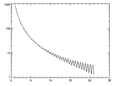
PLOT_IO, FINDGEN(1001)/50 + 1, ppval
Figure 2-67 A plot of the cubic spline interpolant of function f(x) using PLOT_IO.

Figure 2-68 A plot of the cubic spline interpolant of function f(x) using PLOT_IO.
x = FINDGEN(100) * 10
y = x + 100 * COS(0.05 * x)
pp = CSINTERP(x, y)
ppval = SPVALUE(FINDGEN(1000), pp)
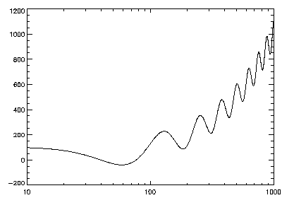
PLOT_OI, FINDGEN(1000), ppval, XRange = [10, 1000]
Figure 2-69 Semi-logarithmic scaling of f(x) using PLOT_OI.

Figure 2-70 Semi-logarithmic scaling of f(x) using PLOT_OI.
theta = (FINDGEN(200)/100) * !Pi
r = 2 * SIN(4 * theta)
PLOT, r, theta, /Polar, XStyle=4, YStyle=4, $
    Title='POLAR PLOT TEST'
AXIS, 0, 0, XAxis=0
AXIS, 0, 0, YAxis=0
temperature = [50., 40., 35., 60., 40.]
pressure = [1025, 1020, 1015, 1026, 1022]
PLOT, temperature, YRange=[20., 70], $
    YTitle = 'Degrees Fahrenheit', $
    XTitle = 'Sample Number', $
    Title = 'Sample Data', XMargin = [8, 8], $
    YStyle = 8, Color = 16
AXIS, YAxis=1, YRange=[1000, 1040], YStyle=1,$
    YTitle = 'Air Pressure', /Save, Color = 16
OPLOT, pressure, Linestyle = 2, Color = 6
LEGEND, ['temperature', 'air pressure'], $
    [16, 6], [0, 2], [0, 0], 2.4, 1005, 2
x = VAR_TO_DT(1992,1,1)
x = DTGEN(x, 12, /Month)
y = RANDOMU(seed, 12) * 1000
PRINT, !Month_Names
hold_month_names = !Month_Names
FOR i = 0, 11 DO !Month_Names(i) = $
    STRMID(!Month_Names(i), 0, 3)
ylabels = STRARR(6)
FOR i = 0, 5 DO ylabels(i) = '$' + $
    STRTRIM(string(100L * i * 2), 2)
PLOT, x, y, /Month_Abbr, /Box, $
    Title='Test Date Plot', YRange=[0, 1000],$
    YStyle=1, YTickname=ylabels, YTicks=5,$
    YTitle='In thousands', YGridstyle=1, $
    YTicklen=0.5
!Month_Names = hold_month_names
For background information, see Chapter 4, Displaying 2D Data, in the PV-WAVE User's Guide.


