Strain Time Response
[ Strain Synthesis ] [ Interpolated
Time Data ]
Once the model was assembled and all of the data transportation had been verified (with the displacement mode shape movie) the next step was to work with the strain mode shapes.
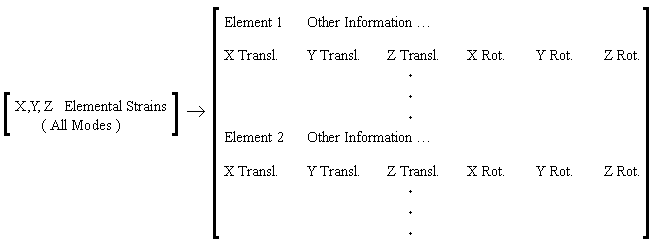
First the data from I-DEAS came out in the format, as given below:
 |
The whole data file is not included here because it is a 75 MB file. However,
a Matlab Code (Extract_strain_info_per_mode)
was written to sort through the 75 MB file and extract just the necessary information.
Here is the documentation on how to determine the
pertinent information from this file.
Once all of the data for each mode was extracted from the 75 MB file, it was
then necessary to transform
the coordinate system from the exported Cartesian into the cylindrical
coordinate system that we were interested in working in and compress the element
data to nodal data. This is done with a
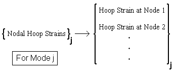
MATLAB code (Get_node_data_from_elem_data) and the result is the Nodal Hoop
Strains for each mode, or Hoop Strain Eigen Vectors.
 |
With the finite element data now in the format that we are interested in, we
can add, in the frequency domain, the response for all of the modes for each
node in the model. The MODAL
ANALYSIS PAGE briefly explains the process used to add the Nodal Hoop Strains
for each mode into a total response. This is where some of the limitations come
into play due to time. Initially, there were over 5000 nodes and in the model,
this would have taken weeks to solve for the total response for each node in
the frequency domain. Even with the reduced model, consisting of about
2000 nodes, the frequency summation took a few days to solve. The MATLAB
Code (Strain Synthesis_guin) was even executed on Guinevere
and still the code took a few days to run. Below is a short flow chart of the
linked code that was run for using just one mode in the analysis.
 |
| Time_response_results |
Here are some results from the hoop strain synthesis with just one mode in the analysis:
| Frequency Response | 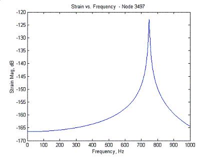 |
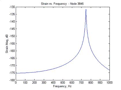 |
| Time Response | 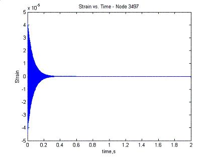 |
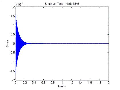 |
Hoop Strain Node 3497 - Lines up with
Gage # 4 |
Hoop Strain Node 3845 - Lines up with
Gage # 8 |
The same code, was run for the case of including more than just one mode in the analysis. Below is short flow chart of how this was done. The difference between the above flow chart is the number of modes that are summed in the frequency domain. This data, however, WAS NOT animated.
 |
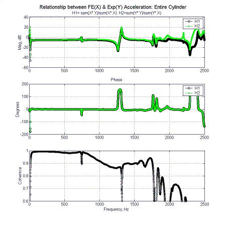
Due to computing time and modeling accuracy, the solution process is cut off
at 1 kHz thereby only considering the first natural frequency. Later a solution
with more natural modes included in the total response can be considered. This
cut off comes from the fact that the FE model loses some fidelity after about
1 kHz. The reason for this is that it becomes harder to model the higher frequency
range with an FE model. And though the mode shapes are correlated from Experiment
- FE model, only the first mode shape is placed accurately in the frequency
domain.
You will see later that the length of the frequency domain and its resolution affects the time domain data during the inverse transform, yielding larger than expected time steps in the time domain.
Below is a figure showing model fidelity drop off after 1 kHz. The first two charts here show the comparison of frequency response functions (FRF) gathered from testing the actual cylinder, and their respective frequency response functions from the FE model. The last chart shows the coherence between these sets of FRFs. A coherence above 90% is considered pretty good, and as you can see from the chart, the coherence drops to below 90% past the 1 kHz range. This means that the FE model's FRFs are not exactly correlated to the experimentally measured FRFs. This is the reason for cutting off the total response at 1 kHz.
 |
|
Frequency Response Assurance Criteria
|