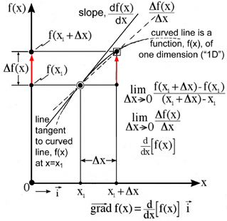
Our idea of a gradient in one dimension (x) requires us to think in two dimensions where the function, f(x), is shown as a curved line in a two dimensional plane, Fig. 1. The scalar function, f(x), is drawn along the vertical axis as a dependent variable and the independent variable, x, is drawn in the horizontal direction which creates a two dimensional plane. Here the gradient of the scalar function, f(x), changes only with respect to the x-axis. This increase is graphically shown by the red arrow shown in Fig. 1. The idea of a change in the property, function f(x), with respect to a corresponding change in the independent variable, x, is fundamental to our concept of a gradient. The mathematical statement of this same idea in the limit is the definition of the derivative which is shown as a line tangent to the curved line in Fig. 1.
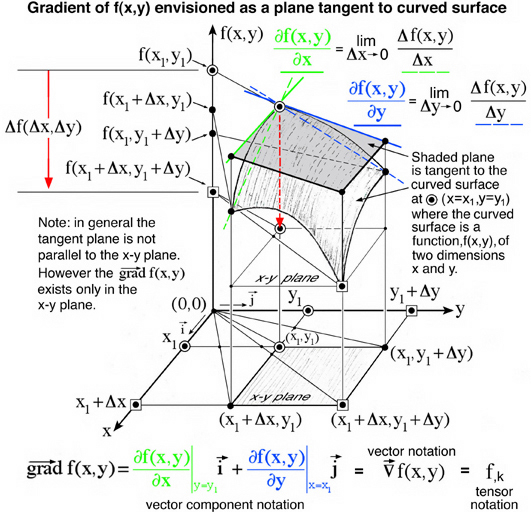
Similarly our idea of a gradient in two dimensions, x and y, requires us to think in three dimensions where the function, f(x,y) is shown as a curved surface in Fig. 2. The scalar function, f(x,y), is drawn along the vertical axis as a dependent variable and the two independent variables (x,y) are drawn as two axis both perpendicular to f(x,y) axis and also perpendicular to each other. Here the function, f(x,y) is observed to decrease both along the x-axis and the y-axis independently which is associated with a plane tangent to the curved surface. This decrease is graphically represented by the red arrow pointing downward in Fig. 2. The mathematical equivalence to this tangent plane is the equation for a gradient of the function, f(x,y), which is shown in the bottom portion of Fig. 2. Each term in this equation corresponds to a line tangent to the curved surface. These two tangent lines, enhanced here with color, define the tangent plane at x=x1 and y=y1. Note, the curved surface, although drawn in three dimensions, is a two dimensional function. There is no z-axis shown here as a third independent variable, but rather the vertical axis is replaced with a dependent function, f(x,y), in Fig. 2. All too often these curved surfaces are referred to as three dimensional functions, because they are envisioned in three dimensional space.
This type of plot has become a popular scientific software tool and is referred to as "raised surface" plots. Typically little thought is given by the user who simply plots the function as designed by the software programmer. At first what appears to be simple plots require a complex set of perceptual, conceptual, and visual cognitive processes, Shah and Carpenter (1995) Ref.[1]. Interestingly this was first demonstrated in 1873 by scientists who envisioned the thermodynamic theory of state as a graphical method, Gibbs (1873) Ref.[2], where "raised surface" plots encapsulted the idea of a total derivative of the scalar energy function. Envisioning the total derivative of a scalar function, f(x,y) , is an extension of envisioning the gradient of a scalar function, f(x,y), of two independent variables. Using energy as a scalar function of entropy and volume, Gibbs (1873) was the first to use this idea to develop his theory of thermodynamic state as a graphical method -- not as an analytical method, Ref.[2]. Although the graphical and analytical methods are related by envisioning the total derivative of the energy as a function of entropy and volume, J. Clerk Maxwell (1874), who was a well known mathematician, endorsed Gibbs' graphical method, without using the equation of state, in the development of the theory of thermodynamic state in his book, Theory of Heat, Ref.[3]. A more complete development of this graphical method as it relates to the total derivative is provided here as a thermodynamic case study. This case study is an excellent example how scientific theory was developed as a reproducible graphical method: "create the graphical method -- discover the science". It is important to note that the development of the graphical method has nothing to do with the use of graphical tools. In 1873-1874 there were no graphical tools. At best Maxwell used clay and plaster to reproduce Gibbs' graphical method. It is interesting that Gibbs did not attempt to draw figures showing the three-dimensional surfaces described in his classic paper, "A Method of Geometrical Representation of the Thermodynamic Properties of Substances by Means of Surfaces", Ref.[2]. With todays computer techonology we emphasize the development of graphical tools and not the graphical method.
Envisioning gradients and total derivatives of two-dimensional functions requires understanding the relationship between three variables, two independent and one dependent, embodied in a simple raised surface plot. Contemporary computer graphic software allows the user to create raised surface plots with little thought. Although effortless to create, these raised surface plots require a complex set of perceptual, conceptual, and visual cognitive processes that demonstrate viewers seldom form an integrated understanding of the relationship between three variables even when instructed to encode them, Shah and Carpenter (1995), Ref.[1]. Historical evidence suggests that Shah and Carpenter's observations are exceptions where prior knowledge accounts for Maxwell's ability to reconstruct Gibbs' graphical method in 1874 as a raised surface plot of three variables: energy, entropy, and volume. Indeed two additional variables, temperature and pressure, where added to the surface by Maxwell. Understanding the relationship of five variables using a raised surface plot is possible because intergrating the complex set of preceptual, conceptual, and visual cognitive processes was realized when Gibbs developed the thermodynamic theory of state as the graphical method. Hence the integrated understanding studied by Shah and Carpenter is only realized if the scientist is engaged in creating the graphical method. If graphical tools are created by others, who are not scientists, the integrated understanding discussed by Shah and Carpenter is not realized by the users of these tools. Even if the graphical method and their tools are created by scientists, history has shown the scientific community will not adopt the use of these graphical methods and/or tools until that community becomes actively involved in the creation of graphical methods and tools. It's all about ownership. Nobody washes rented cars -- 8^). This observation provides the motivation for developing these class notes for ESM4714 that encourage students to create graphical methods within the context of their prior knowledge of math and science: "Create the graphical method -- Discover the science".
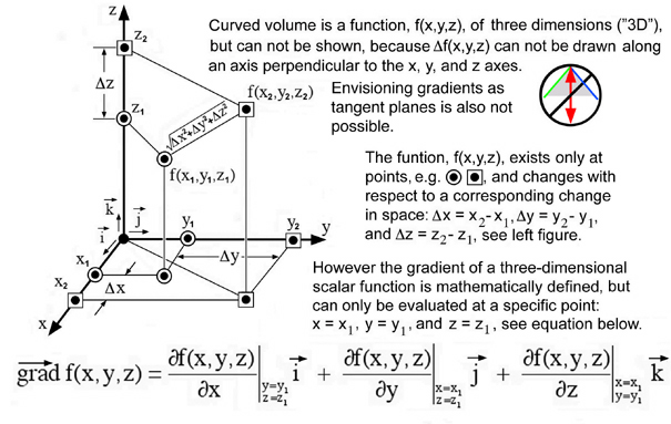
It is possible however to draw gradients for three dimensional functions, f(x,y,z), using orthogonal intersecting planes constructed from small multiples, Tufte, Ref.[4], of a family of one dimensional functions, f(x), shown in Fig. 1. Compression of this function, f(x), is extended to include a family of curves with respect to a second independent variable, T, e.g. f(x,T). This method is developed in the next section where all of these 1D functions are compressed into three planes and observed as color gradients. Drawing functions as color gradients is not new. However the conceptual link of color gradients to a compressions of 1D functions using Tufte's small multiple idea provides an insightful method of describing gradients in 3D. If three orthogonal planes intersect at a common point, e.g. (x1,y1,z1) and move in the neighborhood of this point (possibly oscillate) along their respective axes normal to each plane, gradients in 3D can be envisioned using this idea of a compressed 1D format. Because these intuitive ideas of a gradient can be cognitively combined with our mathematical concept of a 3D gradient, this compression scheme is refered to as a cognitive visual data compression (CVDC) method.
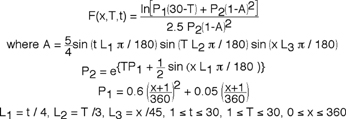 (1)
(1)which can be shown to approach zero in the limit as T approaches 30. Typically these functions are shown as a family of curves. We are very comfortable with this format because we are first taught to imagine functions as shapes (curved lines or surfaces), Figs. 1 and 2. A line tangent to a curve is the derivative and the area under that same curve is the integral of the function. Let's convert a 1D function from a family-of-curves format into a compressed parametric space.
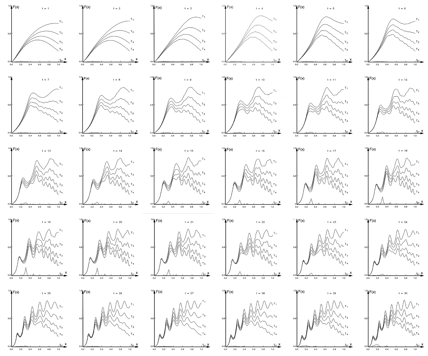
We start by arbitrarily selecting four figures, as shown below in Fig. 4, what Tufte would call small multiples, Ref.[4]. Each figure represents a function F(x,T) at a single instant in time, t, that contains a family of curves each at a different time period, T. Because T approaches zero in the limit as T approaches 30 only a few curves are shown together with the 27th curve which is observed to be near zero as expected. Except for such limiting trends it is difficult to understand how this function behaves until we draw at least a few curves as shown below. With this format our view is limited to a collection of about four to thirty figures total, because this represents a range of figures that can fit on a standard printed page. These same small multiples of thirty figures can be viewed as an animation.
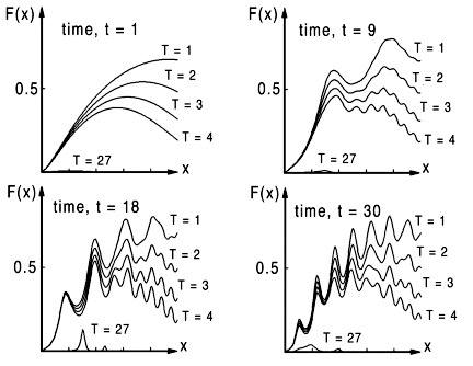
Such complex functions are common to many dynamic systems. When solutions are "chaotic" we have an excellent example of how even simple graphs assist us in understanding functions by observing patterns that would first appear to be totally random. This complexity motivates us to view a larger number of curves in each figure.
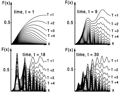
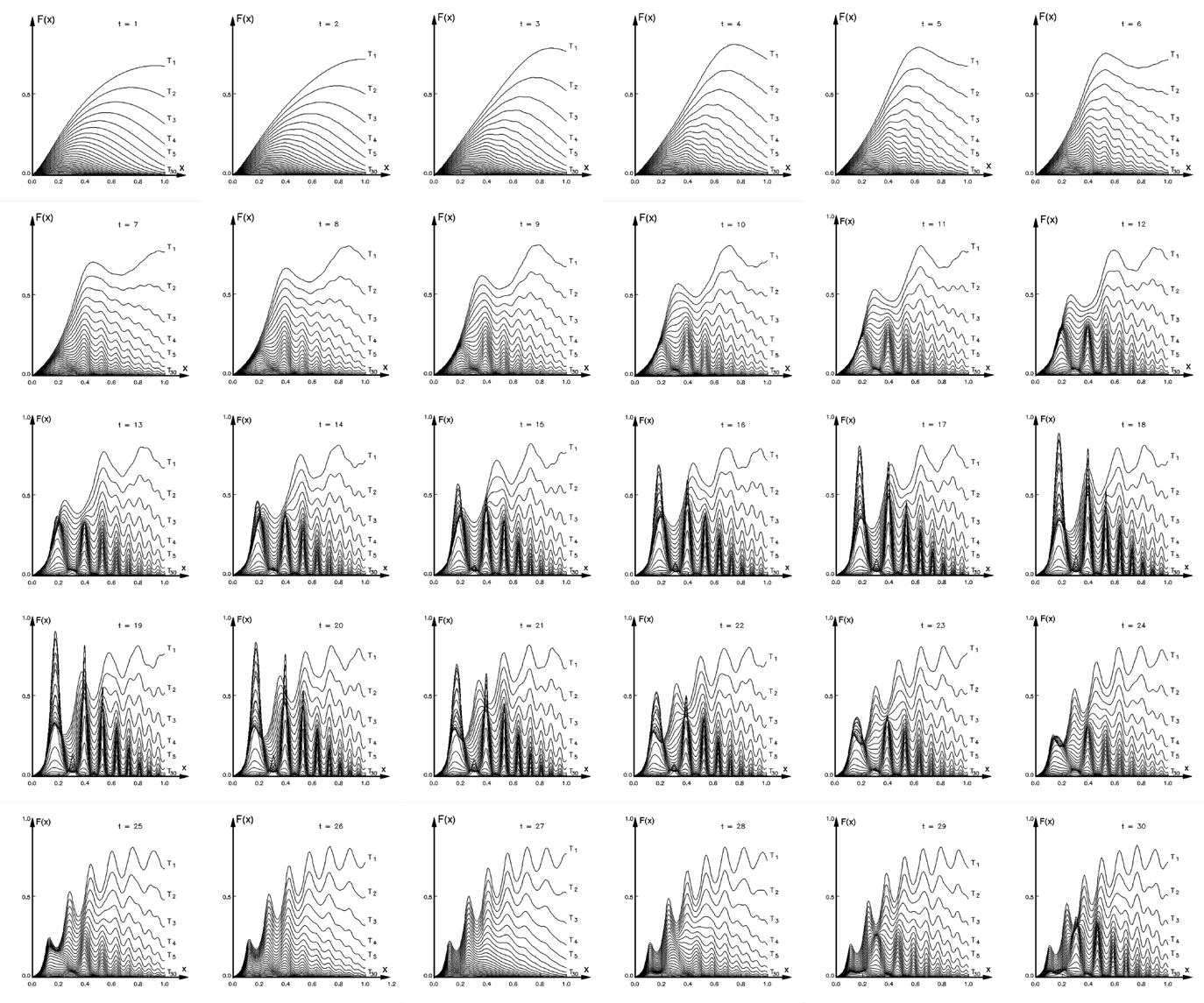
The larger number of curves shown in Fig. 5, demonstrates that a family of 30 curves in each figure not only represents a visual limit in our ability to view data in this format but reveals additional information assumed absent in the previous figure, Fig. 4. In fact we might assume that such an instability would most likely occur in the upper right region where there appears to be more variation with time. However the largest gradient in F(x,T,t) is unexpectedly observed in the lower left region at time, t=18 and disappears at later times in Fig. 5. This can be more clearly seen if all 30 figures at each time step are compared on one page. These same small multiples of thirty figures can be viewed as an animation.
Let's say that for the function F(x,T,t) we are interested in observing a total of 300 time steps (300 figures) with 300 time periods, T, curves in each figure. This would be a total of 90,000 1D curves. Obviously this would result in an incomprehensible blur of curves in each figure. Such a format would be useless to the observer. A typical approach to this problem would be to determine a priori what information to present and what information to avoid. This process of eliminating irrelevant data is a tedious, if not inaccurate, process where we typically assume trends in complex analytic functions, experimental, or numerical simulation data. Each individual has their own unique, if not ambiguous, way of doing this. This process of simplifying is also motivated in order to organize data for presentation. To avoid this ambiguity we propose to compress all 90,000 curves into a single space without eliminating any data. Such an approach, if possible, transcends using graphics for presentation and enables the observer to use graphics for analysis and discovery. This method would also allow insightful comparisons within the compressed format. Can this be done in general?
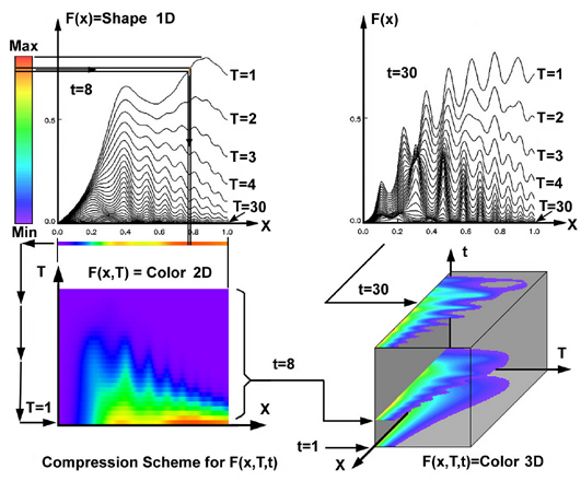
We start by arbitrarily taking the 8th and 30th time slice from the small multiple figure. We start here because a family of 30 curves in a single figure is obviously getting "too busy" and we believe this presentation format represents an upper limit. But we want more than 30 figures, let's say n-figures, where each figure contains a family of m-curves. We proceed first by compressing the 30 curves in Fig. 5 at t=8 and show that this method can be extended to m=300. We start this compression process by placing a color bar next to the left most figure shown in Fig. 6. Next we pick an arbitrary value of x and find the corresponding value of the function F(x). But we continue moving to the left and observe the corresponding color for F(x). We take that color and map it back onto the line. We continue this coloring process by mapping color onto the entire line. Now the color along the line and the shape of the line contain redundant information, hence we can remove the shape but keep the color and move the colored flat line vertically downward to the figure below without losing information. Obviously we can continue this process and easily move all 30 curves into the same space without confusion. This method should also work for 300 lines. It would not be possible to show the same information as 300 shapes in the traditional family-of-curves format.
Functions compressed into such formats are not new. We often see these "color plots" in literature and give little thought to why we find these figures useful nor are most of us aware of their functional relationship to a 1D family-of-curves format. This functional equivalence of color-shape-function allows us to visually generalize the functional visual method even further. For the same reason we can compress m-curves into a 2-D plane, we can also compress n-figures into a 3-D structure by vertically stacking each figure as a 2-D plane shown at the lower right of Fig. 6. It is now reasonable to claim that if there are "l" points for x, "m" points for T, and "n" points for t, then we can compress ( l x m x n ) pieces of data into a compressed visual format that is superior to the traditional 1D family-of-curves format. We now select a visual tool that will allow us to sort through this compressed visual format. This can be simply accomplished by interactively moving the horizontal colored x-T plane, shown at the lower right of Fig. 6, vertically upward with increasing time and stopping at any arbitrary time for comparison. In Fig. 6 we captured the 1st, 8th, and 30th time plots where the lower values (purple) have been erased in each plane to aid the observer in comparing how the pattern, hence the function, changes with time. Although useful, this method nevertheless reveals little new information about our complex function. Again we return to using graphics to PRESENT what we already functionally understand. In this case our images simply represent an alternate interesting way to present many 1D functions into a compressed space but perhaps not very revealing.
However if we choose the vertical x-t plane and move this colored plane from the left to the right and observe how this function changes as shown in Fig. 7. Obviously these new colored patterns represent the same function but now the pattern is drawn without prior thought. For most people this new image creates an insightful if not revealing experience. After experimenting with several investigators using this method on a variety of data sets (analytic, experimental, and numerical), the response was very interesting. In all cases this function was not thought of before (a priori) and typically the investigator enthusiastically proceeded with this new method operating on other functions or data sets. What appears to be new information in the other planes shown in Fig. 7 is the visual equivalent to our idea of a gradient of a scalar function. In its simplest form such a gradient can be constructed as a 1D quantity, where we fix a value for T and t and proceed to track how F(x,T,t) changes along a line parallel to the x-axis. But in Fig. 7 we observe gradients for an entire range of T and t. Unlike Figs. 1 and 2, it is not necessary to mathematically specify a single point in each plane, since the gradient for each of the three planes applies for all points in that plane. When all three planes are combined, gradients in three dimensions (3D) have been approximated from a collection ("compression") of numerous 1D curved lines. Stacked planes in Fig. 7 approximate color gradient changes corresponding to movement. Hence our idea of a gradient in 1D extends graphically to representing gradients in 3D. Note, this technique can be used for any arbitrary function.
.jpg)
Figure 7. 3D gradient of a scalar function visualized when color patterns change with moving orthogonal planes.
Further investigation reveals that uncompressing the x-t xplane would be equivalent to redrawing 300 figures with 300 different curves in each figure where t and T are interchanged within the traditional 1D family-of-curves format. This TEDIOUS task of redrawing 90,000 curves reduces to a much simpler (if not revealing) visual method of moving and observing changing patterns <-> functions as we move the x-t plane through various values for T.
Cognitive Patterns: The reason why the cognitive visual data compression (CVDC) method, Fig. 7, is revealing can now be simply explained by the same cognitive mechanism described by Richard Friedhoff's explanation of visual experiments conducted by psychologist Donald Michie, Ref.[5]. Namely, most people exchange functions with visual patterns.
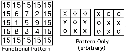
An excellent example is to show all possible combinations of three integers (1,2,3,4,5,6,7,8,9) that add to 15 without repeating integers, Fig. 8. What could again be a TEDIOUS task is made simple with the following pattern, but try this exercise first without the pattern. In some cases adding color to such functional patterns aids us in this cognitive intuitive process of understanding the origin of functions (i.e. fractals). Interestingly this same functional pattern of numbers can be reduced to a simple tic-tac-toe pattern, Fig 8.
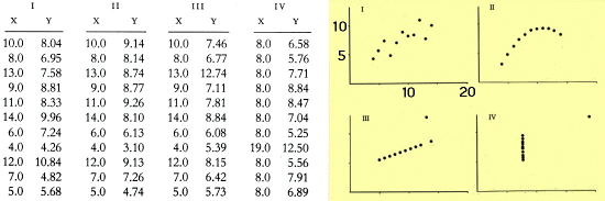
Figure 9. From E.R. Tufte, "The Visual Display of Quantitative Information, Ref.[4]."
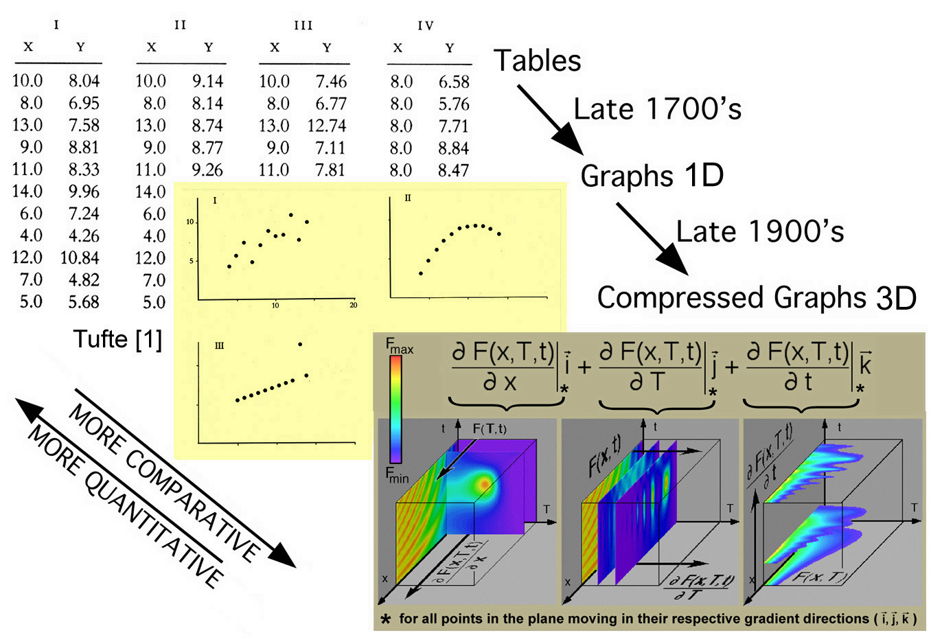
The important point is that we all tend to exchange complex if not tedious functional operations with patterns. With these patterns we can make comparisons that would otherwise go undetected even if these functions are written in their traditional mathematical script (equations), simple graphs, or tabular format. This same point is made by Edward Tufte when he describes William Palyfair's efforts (1759 -1823) to complement (not replace) functions shown in tabular format with a more comparative set of graphs. Comparison of even simple functions in graphical format is cognitively superior to the tabular format but lacks the accuracy. This is demonstrated by Tufte in Fig. 9. This emphasis on accuracy and precision kept simple graphs from scientific archival journals for some 150 years, although comments have been made that this latency in publishing graphics could have been influenced more by the printing technology of the times. Obviously scientists and engineers routinely use both today when appropriate. Perhaps our recent (1985 - 2005) improvements in graphic technology has prompted yet other choices in how we explore and present our complex functions and massive data sets. This chronology is summarized in Fig. 10.
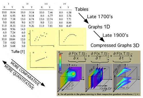
Figure 10. Chronology of envisioning scientific information
Richard Friedhoff [5] also points out that this relationship between functions and visual patterns is fundamental to the way scientists create their functions to begin with. This was demonstrated by Josiah W. Gibbs in his first of two historic papers, "Graphical Methods in the Thermodynamics of Fluids", 1873, where he developed thermodynamic analytic experssions and their corresponding graphical methods, such that others could reproduce both. However the graphical methods originally developed by Gibbs were not reproduced by others but the analytic expressions along with the thermodynamic theory were and have been used to this day. An exception was demonstrated by James Clerk Maxwell, who created a three dimensional surface in 1874 showing the thermodynamic relationship between energy, entropy, and volume (equations of state) in clay and plaster. Perhaps the original thought that created these images were not fostered over the last 134 years -- because graphics technology in 1874 was inconveniently just clay and plaster. However this didn't stop Maxwell who reproduced the graphical method originally published by Gibbs. The emphasis on understanding the thermodynamic relationships by developing an insightful graphical method is not exaggerated. At the end of Gibbs first historic publication, he concludes,
This discussion hopefully demonstrates how scientific visual insight can occur both initially when scientists develop their theory and later when they intrepret their large data sets with well designed graphical tools. Either way scientists have not been encouraged to create visual methods together with analytic models and scientists rarely participate in constructing "well-designed?" graphical tools. The demographics of recent IEEE Visualization conferences demonstrates only a small participation of engineers and scientists. In another recent scientific imaging workshop a participant in a video clip is quoted, "I don't want scientists to become too visually literate, because they'll put me out of a job". The "Return to Visual Thinking" discussed by Tom West is only slowly being realized by the scientific community. This is why these web pages and class (ESM4714) were created, that is to encourage the next generation of scientists and engineers to think visually and create visual tools as they understand the science. Better collaborations between scientists and information scientists also need to be fostered where scientists participate in the creation of the visual tool's. It is important to understand that the visual insight, which is experienced by the scientist when developing the theory, is not associated with the development of a visual tool. However the scientist's visual insights when developing the theory can be integrated into the development of visual tools. Unfortunately the popular response from the engineering and scientific community is that visualization is just a tool where the development of the tool is not part of the scientist's creative process. History proves otherwise -- insightful and reproducible graphical methods were developed by scientists before well-designed visualization tools existed (Gibbs 1873). The opportunity now exists to integrate that insightful scientific experience into an insightful tool.
So how do scientists think when working with functions and visual patterns? Because scientists think before they draw a pattern, that represents a function, this cognitive process has become unidirectional. This cognitive connection between thinking and then drawing has become a popular way to visualize scientific data. This popular thinking has however become implicitly unidirectional to the point that scientists do not realize how unidirectional this thinking has become until they, for example, return to Fig. 7 and select a plane where the computer draws patterns in the x-t or t-T planes and they realize that the reciprocal could also be true: patterns can come before thinking about the functions. Hence, scientists have the opportunity to discover functions from patterns. This is what Gibbs was referring to in his conclusions of his first historic paper. This cognitive mechanism between functions and patterns does not presuppose the order. Which comes first is an irrelevant question. Ivestigators and instructors can use both: for pedogogically designed presentations (thought first then pattern) and for scientific investigation, discovery, and insight (pattern first and then thought). If this thought-then-pattern cognitive mechanism were truly unidirectional then computer graphics could only be used for presentation.
In Fig. 7 the CVDC method encourages the use of the "pattern then thought" cognitive use of graphics. Returning to Fig. 7 we see that the original 90,000 curves can now be shown in yet two more planes, hence, we have an additional 180,000 curves making a total of 270,000 curves to think about. Of course present graphic technology is not limited to m=300 and n=300. Hence we can work with even larger and more massive data sets. Higher resolution displays would allow for a higher density of compressed one-dimensional curves into the viewing area. As already pointed out, insightful relationships of data in Fig. 5 was not observed in Fig. 4 because each individual has their own unique, if not ambiguous, way of selecting how much data to visually represent. To avoid this ambiquity higher density of compressed curves can be realized using the CVDC method on high resolution displays. This high resolution of data compression also increases the possibility that different observers will arrive at similar conclusions. This exemplifies how visual insight, although improved with well designed graphical tools, at best remains a serendipitous process and lacks reproducibility. None the less these improved graphical tools are insightful which can be communicated to others by presenting the visual results but not necessarily reproducing the experience that lead to the insight. If these results are presented to others, who have the same scientific background, it is possible that the insightful experience can also be shared as well. If not, these scientific images will always have presentational value.
It first appears that this method can only be used for a single scalar function. It would not be possible to observe more then one color gradient (scalar-function) at a time if the observer is confined to determine how color (function) changes in a moving plane. But it is possible to use other graphic features that allow the observer to view more then one function in the same parametric space. Hence there exists an opportunity to visually explore multiple functional relationships if each function has the same basis (parameter space). But before this method is generalized to more then one function, some simple and hopefully instructive examples of investigating single functions is demonstrated using the CVDC method.
Before you proceed to specific CVDC examples listed below, keep in mind that the usefulness of this cognitive visual approach is coextensive in its' application. It is also possible that different users would arrive at different results depending on how each user organizes and perhaps more important the scientific context each user brings to this process. The use of the tools may be subjective, however the development of the graphical method is mathematically reproducible.
.jpg)