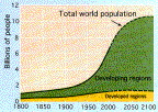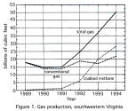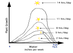
One purpose of scientific investigation is understanding the relationship between two variables: for example, how nitrogen in the soil affects plant growth, how temperature affects the viscosity of a substance, or how time affects the world population. Typically, scientists use 2D graphs to visualize the relationship between two variables where the value of the dependent variable varies along the vertical axis and the value of the independent variable varies along the horizontal axis. Consequently, a scientist can predict, see ("visualize"), and understand the change of a dependent variable, like viscosity, with any change of an independent variable, like temperature.
World Population Oil Production Plant Growth


To accurately represent the world, scientists need to examine more than one independent variable at the same time. Three-dimensional graphs allow visualization of multiple independent variable data sets. The following tutorial will show you how to analyze, create and use 3D graphs of large data sets.
Last revised July 15, 1996
http://www.sv.vt.edu/class/surp/surp96/laughlin/stat/3D_tutor/3D_tutor.html